IELTS Sample Reports
✨ These are real premium reports.
Try for Free6.5/9.0
Overall Band Score
B2
CEFR Level
The response gives a clear overall trend and some key comparisons, but it includes inaccurate details and unsupported interpretation such as reasons for the changes.
The report is generally organized in a logical order, but linking is sometimes awkward and some sentences reduce the clarity of comparisons.
The vocabulary is sufficient to describe trends, but word choice is often informal or inaccurate and there are several collocation mistakes.
The writing uses a mix of simple and some more complex structures, but frequent grammar errors in verbs, agreement, and noun forms reduce accuracy.
Detailed Feedback
Academic Task 1
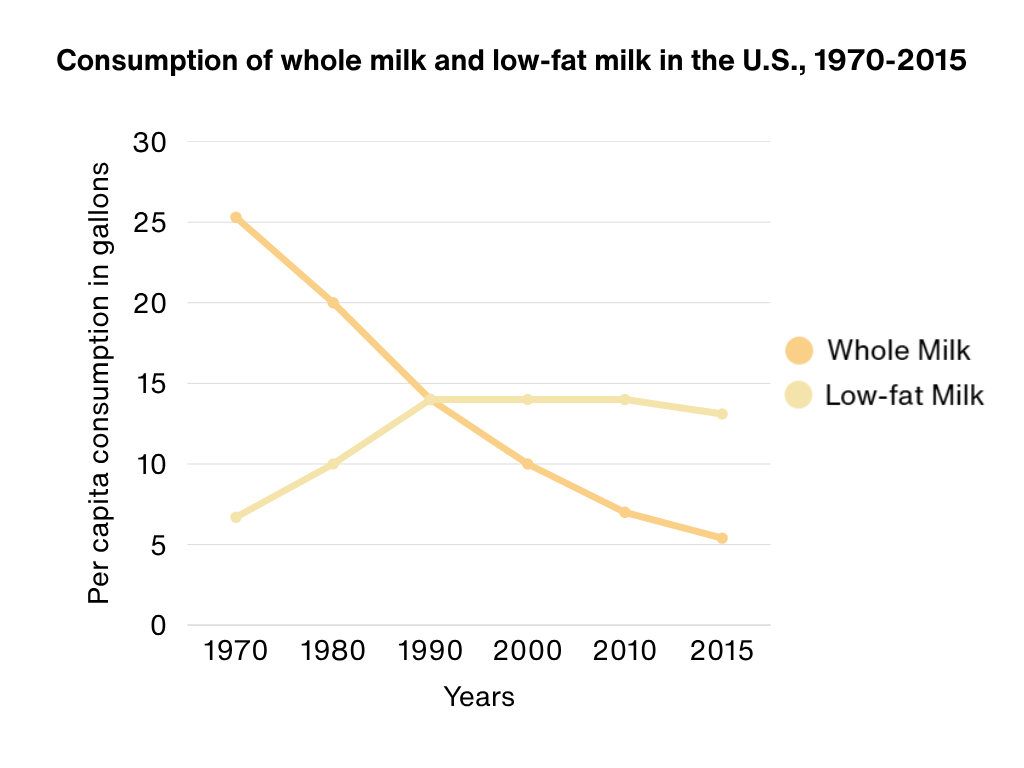
The graph below shows the per capita consumption of whole milk and low-fat milk in the United States between 1970 and 2015. Summarize the information by selecting and reporting the main features, and make comparisons where relevant.
226words
Great! You've reached the minimum word count of 150 words.
Content directly copied from the writing task is excluded from the word count.
Your Answer
The line graph shows how much milk people in the US drink per person from 1970 to 2015, comparing whole milk and the low fat one. Overall it is clear that people prefer low fat milk more and more and whole milk go down a lot.1 I think the biggest change is people switch to healthy milk.1 In 1970 Americans drank about 25 gallons of whole milk but only around 6 of low fat. By 1980 the figure for whole milk drop to roughly 20 while low fat increased to about 10 liters.2 This is a very big increase, maybe fifty percent.3 In the 1990s they are almost the same, near 15 each, so the gap is closed.4 After that whole milk keeps decreasing to 10 in 2000 and about 6 in 2010, then close to 5 percent in 2015.5 On the other hand, low fat went up to around 14 and then it stayed almost stable for many years before a small fall at the end.6 To conclude, people changed their habit and moved from full fat to low fat because of health reasons and advertisements etc. The total amount of milk together looks about similar over time, but low fat already overtake the other one around 2000 which shows a strong preference of modern peoples. The chart is easy to understand so the trends are obvious.7
Task Achievement Errors
Overall Overall, it is clear that people prefer low fat milk more and more and whole milk whole milk go down a lot. I think consumption fell steadily and sharply over the period, while low-fat biggest change is people switch to healthy milk. milk consumption rose until about 1990 and then stayed almost unchanged. Whole milk was much higher at the beginning, but low-fat milk became the more consumed type later.
The overview should report the main trends shown by the graph, not personal ideas. 'people switch to healthy milk' is an interpretation not supported by the chart. A stronger overview should clearly mention the sharp fall in whole milk, the rise and then stability of low-fat milk, and the change in which type was more popular.
By 1980 the figure for whole milk drop dropped to roughly 20, while low fat low-fat milk increased to about 10 liters. gallons.
The graph uses gallons for both lines, so '10 liters' is the wrong unit. In Task 1, correct data and units are important for accuracy.
This was a clear very big increase, increase maybe fifty percent. from about 6 gallons to around 10 gallons.
The graph gives approximate values, so it is better to describe the change directly with data rather than add an uncertain calculation such as 'maybe fifty percent.' This makes the report more accurate and better supported.
In 1990s they are almost the same, near 15 each, so the gap is closed. 1990, the two figures were equal at about 14 gallons.
The graph shows one point for 1990, not a general statement for the whole decade. Also, the value is about 14 gallons for both types, not 15. This revision makes the comparison more precise and accurate.
After that whole milk keeps decreasing to about close to 5 percent in 2015. that, whole milk kept decreasing to about 7 gallons in 2000, and around 6 gallons in 2010, and close to 5 gallons in 2015.
There are two task achievement problems here: the 2010 figure is closer to 7 than 6, and the unit in the original is percent not gallons. Accurate reporting of figures is necessary.
On the other hand, low fat went up to around about 14 gallons low-fat milk rose to about 14 gallons by 1990 and then stayed almost stable for many years remained at around this level in 2000 and 2010, before a small fall at the end. falling slightly to about 13 gallons in 2015.
This sentence has the right general idea, but it needs more specific support from the graph. Adding the key years and figures improves the description of this trend.
To conclude, people changed their habit and moved from full fat to low fat because of health reasons and advertisements etc. The total amount of milk together looks about similar over time, but low fat already overtake the other one around 2000 which shows a strong preference of modern peoples. The chart is easy to understand so the trends are obvious. [Removing this paragraph]
This conclusion adds causes and opinions that are not shown in the graph, such as 'health reasons and advertisements.' Task 1 does not require a conclusion, and personal opinions reduce the score. The key comparison about low-fat overtaking whole milk should have been made in the body.
[After 'On the other hand...' paragraph] Add: Low-fat milk overtook whole milk after 1990: low-fat was higher in 2000, 2010 and 2015.
A key feature of the graph is the change in which type of milk had higher consumption. Your report mentions both trends but does not clearly state when and how low-fat milk overtook whole milk. Adding this comparison directly improves the Task Achievement score.
Find your IELTS Academic Writing score
Get scored instantly. Real feedback based on official IELTS criteria.
Try for FreeNo credit card required